Work Text:
 UTC
UTC
Don't Panic!
Targeting specific AO3 work sections (not site) with CSS effects
NB: This sorta-tutorial's layout is optimized for computer monitor aspect ratio, hence comes out kinda funky on narrow viewports (e.g.: 'phones).
CONTENTS:
Intro.
(Incl. several very interesting resources, plus a retrospectively obvious goof, an awkward surprise [also obvious], and a mistake [and how to fix this last one])
Description
(Shows how the entries are laid out)
Each section
(How to target each section, and what's needed for one-shots vs. multi-chapter;
NB: some have further resources and very specific observations)
Closing notes
(Further resources, Star Wars crawl text CSS w/ starfield background image in the Summary, and an alt. way to fill entire site page [not just the work area], image color / monochrome filters, several ways of overlaying images, and a site skin rule to remove images)
Footnote #0
(How to add a second [hidden / secret] footnote section)
and here's how to style comments, as laid out in a styled comment for proof
Intro. Contents ↑
This is a QRL (Quick Reference List) — a layout roadmap, not a tutorial (also: I tested it all in Chrome, in WIN 10, on a tower desktop; I couldn't bring myself to check everything across Firefox, Opera, Edge, MS IE, TOR, iPhone Safari, and Android Chrome [I can't remember if I checked it on the WIN 11 laptop], though since then I'm now on a new tower and WIN 11, and things seem to check out so far).
It started as a test of the grey fill rule for my eventual Snoopy - Silent Hill crossover (currently scheduled to be the 14th Snoopy fic from now, interspersed with 13 Peach/Zelda & Sonic fics and 13 fics of other fandoms... i.e.: 40 fics hence — that'll take a while to get there, so here's the It was a dark and stormy night series link to check and see how far along it's gotten, in case I forget to link that fic for reference when I finally do get that far and finish and upload it); I just wanted to put a simple atmospherically-spooky lightly-foggy background onto the work.
This was only a test.
Then, in an inadvisable spasm of ADHD (since I had intended to research all relevant material on The Fly [5 movies so far, plus the gripping short story that started it all] for the current-next fic on my schedule [another Snoopy crossover]), I figured that with the questions about how to target specific parts of a work's portion of the page, and bits and pieces of that incompletely delved info. scattered throughout several comment threads and at least the font tutorial's subsection on ZachStarAttack's color background (and the two spots linking to Dustnik's write-up [AO3 CSS Selector Ids and Classes ], though perhaps not the section on using CSS selectors in chapters), I might as well deep dive in order to test all relevant variables and share the findings as coherently as I could manage. (This is the curse of AS/HFA hyperfixation and arguably OCD: need one little thing, plunge into every aspect. Welcome to my world! 🙂)
This QRL presumes the reader to already be familiar with how to make a work skin and apply it to their work(s). It isn't aimed at CSS effects themselves (NB: you might want to check compatibility of any specific CSS property at caniuse, along with the usual suspects of MDN and W3, and maybe bump your target URLs against AO3's regex URL whitelist... and still check the final form against all public site skins or at very least Reversi ?style=929.), only at mapping out and charting which locative selectors to use in your work skin rules in order to apply your CSS effects to specific parts of your work (and it doesn't look at the parts of the page above or below the work section: this isn't aimed at making site skins) — that is: it's aimed not particularly at images or font colors (e.g.: making all links blue and underscored) or other specific CSS effects themselves as such (e.g.: #workskin .title { text-align: left; }), but instead and only at how to cause them to occur in whichever work section(s) one wishes their effects to be located. With that said, however, it seems that one's work skin can act to override even the sections of the browser page that aren't within the work itself (that is, a work skin acting in a site skin-like manner ): cf. Mewsmodeus (Mewzebub)'s work I'M NOT AN FANFIC AUTHOR PLEASE DON'T CURSE ME for an astounding example of a work skin overlaying the entire site-level page (with chapter 5 referring to feind's work on an AO3-work-insertable-script-link for substituting text in Custom Names in Reader-Insert Fics (Yes, really!) [operating by clicking a link in the work, which opens a window to a javascript page where you input the desired replacement, which then mod.s the embedded .svg image in the fic.], and I've seen another with multiple links to select various effects, and a final link to download the external source's result) and limin's M00D 0RG4N for a similarly distinct piece; I won't go so far as to reveal all of Mewsmodeus's secrets there (or even claim the skill to do more than see the method after digging through line-by-line for a day and a half), but I'll drop some breadcrumbs: the work skin causes the effects, yes, but it's not calling a site skin nor applying one that's embedded directly in it (not... precisely ), instead the key lies in <figure> <a name="cssoff" rel="nofollow" id="cssoff"></a> <div class="cssoff tab"> <div class="qtip-content"> (with some further details from the author in this comment thread, pointing credit specifically to mystyrust's really heavy duty suspend disbelief ).
(I don't adjust my view of the site overall, and so know essentially nothing of site skin particulars; for that, though I cover them slightly elsewhere [because that tutorial, aimed only at affecting fonts within your work via a work skin, ended up with a few site skin comment-questions], Ask Ao3 Skins has what looks like a good intro., and the slightly different results of one AO3 search and another and of browsing the Public Site Skins could prove useful.)
The great chunk of material came from InfinitysWraith's material (linked farther down, while covering Summary modules' differentiation), itself inspired by C Ryan Smith (AiedailEclipsed)'s [whose byline I keep forgetting — I can never remember it, for some frustrating reason!] How to Override the Archive's Automated Chapter Headers. Some of the variables are covered in /skins/855 (14) group preface (cf. /skins/873 Archive 2.0 ). A few (#workskin .chapter, #workskin .end.notes.module, and #workskin #work_endnotes) I got from viewing / inspecting the page source of my QRL-test work (recursive logic loop, much?); likewise, some of the necessary combinations were a bit a pain to finagle (chapter header-notes only and work header-notes only come to mind, along with the Edit Chapter button's contents [with further thanks to ElectricAlice's flat buttons site skin for an extra hover effect] and the series links at the bottom of the page [always inspect elements, and dig up and down the tree beyond those parts that you're interested in or even expect to be able to use/affect: you never know what you'll encounter <FNORD!>, maybe even a value of bleem-many]). I tried to go from the top of the work page area downward whenever possible (the same as one would read this QRL), but parts are done necessarily from all-encompassing to less-encompassing, and others are parallel variations, while yet others would fit well in more than one section. I also tried to cover as much as possible, but surely there must be some locative selectors that I haven't found (and I suspect that the way to link to specific chapters' specific sections begs that very question); browsing through the Public Work Skins might yield further locative selectors and novel/useful permutations, and especially the many resources in chapter 1 of Anonymous's Coding Encyclopedia (which I ran across only on 30 Jan 2025).
However, if you want some real voodoo, then check out TrueMaybeFalse's Who am I?. When you're done, do it again. Pay particularly close attention, 'cause I guarantee that you missed a bunch. Dig into the Inspect, dig into the Page Sources. For all of the cool shit there, I was still stunned by ch. 9 (though it made sense, after some consideration) and esp. ch. 11 (still trying to figure that one out). It looks as if there might have been something interestingly cryptic on their(?) FFN in 2022/2023, too.
When you're done there, spin by mystyrust's do you believe in coincidences?. Looks cool, right? Some work went into making it all pretty? You ain't seen nothing yet. Pay attention to it: there's a lot going on in order to make those special effects, the selectable text that types itself out before your eyes. How do you account for all of that in the CSS? Hmm... poke around in the article section, and see where that leads you (an anonymous fic, an Easter Egg of hacking into Vlad's computer [it's a Danny Phantom thing], offsite hosted material [just a hint: new.fly], then straight into another fic entirely; you can eventually find ref. to her GitHub, but you need to dig in this baby to realize how incredibly in-depth this rabbit hole goes). That shit's next-level. (NB: there are more hardcore works like this, but the easiest thing to recommend is simply for you to hit the tag, the Fanwork Research & Reference Guides tag, and the collections that this QRL is in.)
Either way: as always, all links herein that can be archived on Wayback, have been (typically already by someone else when I went to check, though in this case, all but one of the images are mine [hence brand new, not previously archived], leaving only the one from a fandom Wiki [oddly not already archived], and obviously the linked works by others aren't mine; if any fail or become corrupted, then try the address without the Archive prefix [truncate the URL until you reach the second https://[...] for the original Pinterest image], or in either case you could swap out the [...]/1200x/[...] with a lower [...]/736x/[...] resolution).
Edit 28 Jan 2025: 9 of the images ceased functioning, and upon opening their addresses, Wayback claimed never to have seen them (let's not get into the fact that Wayback's saves are where I got their URLs from in the first place...) — which wasn't as surprising as it should have been, given the .notes.module .userstuff's first image having refused to save then and each day since (though Wayback magically found the save this morning); so, although I have now backed them up again, I'll continue to monitor, and resort to the original Pinterest URLs if necessary (lesson being: don't trust Wayback as some permanent or even reliable record, especially after last month's offline problems).
Update, +6 hours: Make that 10 fails....
Update, +3 hours: And another 12 fails (one that's duplicated x11, since they're all single-chapter pic.s not affected by a multi-chapter rule, and one multi-chapter [with which Wayback is currently cycling back to itself], so really only 2 further fails)....
Update, +11 hours: And 9 more fails (1 being another of those same-picture-no-effect, accounting for 2 total). So far, every fail has been a unique URL, so perhaps it's simply that I had saved too many all at once when I backed them up and Wayback somehow spazzed out due to this? I doubt that, but I've seen crazier things (straight Boolean — that I had put into a clean new spreadsheet's cells — deciding to do something entirely different, for example). Either way, that's so far a subtotal of 31 failed pic.s out of the total 32*3=96 triplet pic.s (the blanks in the example-triplet obviously don't count, though one could argue 96+1 for the secret room's pic at the end), essentially 1/3.
Update, +5.5 hours: 3 more image fails (one being that just-mentioned “+1”). Clearly, either something went wrong with my initial saves (or has gone wrong since), or there's a larger issue with Wayback. So far, none have been repeats... yet. I presume that the matter will resolve itself once the total 96+1 will have been cycled out, but if I encounter any re-re-saves (before, or obviously after, that), then I'll dump the lot and default to the original Pinterests. I no longer have any faith in Wayback, thanks.
Update, 06 Feb: On the fourth, the Star Wars crawl (so... Feb the Fourth be with you ? 🤣) CSS-bonus section's Waybacked image failed. I noted this here at the time and tried to Wayback it again (failing, since Wayback kept claiming that there hadn't been one, and offering to back it up, then upon supposedly having done so, the link went to the search's null-result and offered to back it up), but while annotating a problem and its solution (to do with AO3's default comment setting) this morning (it's 01:15, so still 05 Feb in my mind), I skimmed the page as usual and found the pic. gone again (reverted to the Wayback URL instead of the Pinterest URL)... along with my previous update re. same.
Update, 22 Feb: Sayonara, Wayback. The images are hicupping, sometimes showing up, sometimes not (“503 Service Unavailable No server is available to handle this request.”), all at random. Time to sigh, throw in the towel, and just make them all direct Pinterest URLs (oh joy: the remaining 188 deletions... well, 186, since the “Secret Level” image wasn't cooperating without the Wayback [I'd complain and ask around on the Internet Archive's forum, but it's been an amazing service, and all for free, so who am I to bitch?]). If you need to find their possible-backups, you can feed the Pinterest URLs into Wayback and see if it spits up anything....
-
For test purposes only, I used
background-image: linear-gradient(to bottom right, blue, yellow);, for surety of obvious effect and clear gradient, thoughbackground-image: linear-gradient(to bottom right, red, yellow);also makes a necessary appearance in one case of differentiating separate chapters' effects (as does the fog [below] once, and a few cases ofbackground-image: linear-gradient(to bottom, #00000000, #00000000);), -
...and when I finally finished everything I went a little nuts demonstrating the color effects on this QRL's own opening sections (they look to me like an explosion at an ice cream, sherbet, sorbet, and fruit smoothie shop [and somewhere in there, probably frogurt and helado]... in an episode of Miami Vice, but the goal was only an eye-catching proof of concept, not tasteful interior decorating) — in case you're particularly curious, they happen to have included
#workskin { border: 1px solid black; }and#workskin .userstuff.module { border: 1px solid green;and#workskin .chapter { border: 1px solid red; }(these three borders were a little too distracting, too visually busy, and too encroaching, and so I pulled them, but mention them here for their value in delineating where these sections lie on the page: they're worth trying your hand at, for a quick impression of things: the exact amount of gap space between them varies with the combination, which I go into a little in their entries, though I didn't try all four combinations [still resisting the urge to do so...]), before settling on only the calmer#workskin .preface.group { background: #FFE4E199; }
#workskin .title { background: #AFEEEE70; }
#workskin .preface.group .byline.heading a { background: #DDA0DD50; display: flex; justify-content: flex-end; margin-left: auto; margin-right: 0; margin: auto 25px; }
#workskin .summary.module { background-image: linear-gradient(to bottom right, pink, yellow); }
#workskin .summary.module h3.heading { font-family: Segoe Script, Noteworthy, Comic Sans MS, Comic Sans, MV Boli, "Ink Free", Lucida; font-size: 2em; }
#workskin .notes.module { background-image: linear-gradient(to bottom right, PaleTurquoise, yellow); }
#workskin .notes.module h3.heading { font-family: Segoe Script, Noteworthy, Comic Sans MS, Comic Sans, MV Boli, "Ink Free", Lucida; font-size: 2em; }
#workskin .series.module .series { background: yellow; } -
I also played with grey in same diagonal gradient
background-image: linear-gradient(to bottom right, #80808099, #B2B2B299, #DDDDDD99);for the actual fog effect itself (y'know: the thing that dragged me down this rabbit hole in the first place?) andbackground-image: linear-gradient(to bottom right, #33333399, #99999966, #DDDDDD99);, -
but finally settled on using [vertical, not diagonal]
for the eventual fic's declaration (hopefully both subtle enough as not to thump the reader over the head with a metaphorical ballpeen hammer while also being obvious enough as to be reasonably... well, obvious ) — hexhomos's#workskin {
/ * Shadow is mod of hexhomos's THE FACT THAT SOMETIMES MEAT GETS CAUGHT IN THE GEARS OF THE GRAND MACHINERY WAS A SMALL CONSOLATION */
/ * Shadow's result is complete side-to-side background color, not just work area */
/ * NB 09 Feb 2025: (thanks to magicalfrog's heads-up) for a similar padding with different execution, cf. hearker (heark)'s How to target specific elements of your work (for work skins) (released on the same day as mine! 😲) */
position: relative;
margin: none;
box-shadow: 20em 0 0 #AFAFAF99, -20em 0 0 #AFAFAF99;
background-image: linear-gradient(#DDDDDD99, #80808099, #DDDDDD99);
}boxshadowin the original comes out way smoother than my execution above, since it matches their work area's background, where mine is set to the averaged hex color value (you can't simply take two hexes and average the two values: you must convert to RGB, average each color alone, and convert that new RGB [prime] back to hex) and braces the work area's gradient rather clunkily (I'm currently trying some workarounds to simulate the gradient with the shadow, since applying the gradient to theboxshadowdirectly isn't permitted; failing that, I might default frombackground-image: linear-gradient(#DDDDDD99, #80808099, #DDDDDD99);to a simplebackground: #AFAFAF99;in combination with theboxshadow); - cf. Green Rain as a demo. of visual effects layers; see also W3 gradients reference page, if you want to pursue applying gradients to your background or as a text effect.
NB: Parser doesn't care (17 Jan 2025) if I spell it “grey” vs. “gray”.
Just as a side note, I discovered a fascinating new glitch in the process of all of this.
Having marked out at least 24 entries (and I could swear that there had been one or two more...), I wrote out this whole intro. section and then in the process of going through each of the entries and applying the rule and cropping screenshots, decided to edit the relevant Summary and Notes sections... only to find afterward that my main body content had reverted to the state that it had been in several versions earlier with multiple data no longer present and no intro. and all of the pic.-tables removed (which should be impossible: once you've posted it [to an Unrevealed Collection, in my case, until ready for public release], it's done, and the only way for it to return to a previous state should be for you to overwrite it [presumably from some previous version saved offline or elsewhere — or to have opened another tab before making all of those changes, and then saving the old tab's unedited version instead of or after the newly edited version {simply ALT-back-arrowing will bring you to a previous editing page, but contain only the most recent save version}]) — the opposite of writing something unsaved and seeing it disappear. 😑
Fun fact, in two parts:
Just a quick reminder here, but if you post a work to a series, and that work is in an Unrevealed Collection (which I do when preparing a work for release on AO3, so that I can edit and proofread and adjust last-minute HTML/CSS, etc.), then that series won't count toward how many series you have, nor will that series appear on your Series page, nor [most egregiously] will any of the other works in that series be visible either — that's easy to fix, simply by removing that one work from the series (until you're ready to post it for public consumption) or by removing it from the Unrevealed Collection (if your work is ready to be released).
With that said, however, I experimented with an old fic in one of my series before adding this note, just to ensure that I had remembered correctly (and to see if this were still the case): I added that fic to an Unrevealed Collection... and upon removing it from there [since I'm subscribed to myself in order to know when my fics' release notifications drop] was unpleasantly surprised to find that I received an e-mail notification (as, presumably, did all of my subscribers — sorry about that, everyone!) of the fic that I had temporarily placed into that Unrevealed Collection as if it were a newly-released fic! 😲 🤬 So yeah: lesson learned there, and pay heed.
This has been a Public Service Announcement, ladies and germs; we now return you to your regularly scheduled reading.
Last note: Due to a 6-hour internet connection interruption this afternoon (05 Feb 2025), I happened to check something in my latest Peach/Zelda & Sonic fic on my 'phone. Since I only use my computer and am logged-in on that (obviously), I hadn't noticed the issue before this — for the past 10 days and 118 Hits, this QRL hadn't permitted people to comment unless they were logged-in AO3 account holders (this being the automatic AO3 default setting vs. SPAM-'bots), and likewise the Sonic fic hadn't either for the past 17 days and 73 Hits. It's easy to fix such a problem, of course
-
individually:
- go to Edit in the work,
- go to the bottom Privacy section just above the written story/tutorial edit field, and you find the checkbox for moderating comments and the radio button below it for who is permitted to comment,
- select whichever setup you want, and hit Post;
- go to your My Works page,
- click the Edit Works button,
- select which works you want to edit or click the All button,
- click the Edit button at the top or bottom of the screen,
- go to Privacy section at the bottom of the next page,
- and select whichever radio buttons you wish for who can see your works, whether comments are moderated, and who's permitted to comment on them,
- click the Update button,
- tell the drop-down alert that yes you're sure,
- and wait a few seconds for AO3 to process;
but the lesson here is: always check your new works to ensure that your settings are the way that you want them (in this case: I would have told these works to permit anyone to comment, merely requiring that I approve them in moderation).
My apologies to anyone who tried to comment while logged-out or without an AO3 account!
With this corrected, all comments are welcome here (yes, even Trolls [if amusing] and SPAM-'bots [limit one per apparent build]).
Description Contents ↑
In each test case QRL entry below:
-
To grok is worth a thousand pictures, so there's a left-middle-right triplet of pictures (please forgive the distracting mix of blue and red links in the pic.s: my browser went tits-up [not my third-party extension {nor the CSS rules in the extension, since I'm the one who wrote those, so I know that they haven't changed}: I turned it off and the underscored blue went away, but the red remained], so some [not all?!?] links now appear red (don't know why) if visited within the past 90 days, beyond which Chrome has Alzheimer's and they reset to blue — 25 Feb 2025: finally found the culprit [inspired by a related answer on StackOverflow] by turning off each extension one by one because I'd spotted an injected stylesheet overriding the data block's link color while inspecting TrueMaybeFalse's chapter 11's voodoo [though 9 is a fun puzzle to ferret-out]: a Chrome extension called
Link Control [I use Stylish], an extension that I'd grabbed early on and had forgotten about 😅, though I'm not about to replace all of the images just for that);
- the LHS pic shows the effects of a given rule on a single-chapter work, which is followed by a [hopefully not too obtrusive] color-filled space to act as a buffer, separating the LHS more obviously from the next two pic.s;
- the middle and RHS pic.s show the effects on the first vs. second/end chapters of a multi-chapter work;
- each individual pic has a clickable zoom-in link beneath it;
- an example is shown below this sentence, for context (no associated pic.s for this, hence it certainly should show the alt text [and it will say only “Alt text”, since they get explained a moment later anyway] — if this alt text doesn't show up in this example, or any of the later images do show it [presumably due to the images themselves having failed], then please let me know!):
- Beneath these is a blockquote showing the work skin's relevant CSS rule(s).
- Finally, at the end of each entry, is the written explanation of the affected [target] area to round things out (usually followed by associated notes).
- A single horizontal rule <hr /> follows this to separate it from the next related entry.
- An empty space row <p> </p> and a double horizontal rule <hr /><hr /> and another empty space row <p> </p> demark the end of one subset of related items and the beginning of the more-or-less unrelated next subset (I mean, they're all pretty much related, so...).
It might be easier — for some — to see the correlations between one section [or sub-section] and another to aim at if you also open a New Work tab, in order to go between the examples below and where they show up when making a new work's selections (though don't put too much stock in it, since [for example] the Associations part of the New Work page contains both the Post to Collections / Challenges edit field [which will then show in the resulting work's data block at the top, to be affected by site skins, not work skins] and the Gift this work to edit field [which will show up in the work's header-Notes, and can be affected by a work skin]).
Sections Contents ↑
TESTED SECTIONS:


This entry is just to establish a baseline, a set theoretic null set, wherein no work skin rules are being applied to any specific section, hence no blockquote of rules (yes, my background rules are still there for font colors and highlighting, but nothing targeting the Summary or Notes or what have you).


#workskin {

  background-image: linear-gradient(to bottom right, blue, yellow);

}
fills in all of the background entire block (everything: the whole continuous page) a few pixels wider than the justified edges of the actual story paragraphs' width (i.e.: a slight borderline extra margin of padding).
NB 1: Later chapters are also filled.
NB 2: Parser permits #workskin .body and #workskin .textarea, but they do nothing [in this work skin]; ditto re. multichapter.
NB 3: The limit of the space that it bounds might best be demonstrated with #workskin { border: 1px solid black; } (the current variable under consideration) and .userstuff.module { border: 1px solid green; (which comes up in the second entry down from here) for a sense of comparison and contrast: #workskin alone encompasses a gap space 5-pixels broader on the left and 3 broader on the right than .userstuff.module... until you add #workskin .chapter { border: 1px solid red; } and find that the [red] chapter (which comes up in the fifth entry down from here) budged the LHS [green] userstuff a pixel to the right, though counterintuitively the RHS one to the left (which sounds sensible, initially, until you realize that the [red] chapter is still to the left of the [green] userstuff, rather than outside and enveloping it, hence budging it inward makes no obvious sense).
NB 4: The limiting sides of the work area can, however, be exceeded with a clever box-shadow.


#workskin .userstuff {

  background-image: linear-gradient(to bottom right, blue, yellow);

}
fills in all divs' content text (just not the whole divs themselves).
NB 1: In multichapter, it does this for all chapters' content text — however, it does nothing for single-chapter work (so yes: mechanically, this roadmap / analysis meta, since it has what you and I would call “single chapter”, has zero chapter content from the POV of AO3's CSS ID perspective... or something like that.).
NB 2: At least for what I'm testing, #workskin .module does the same thing (though this might have subtle and/or unforeseen consequences of which I'm unaware), though I have a gut feeling that this might not be by dint of the .module selector itself, but rather despite it (i.e.: ...apparently the actual story part isn't exactly a module or part of one... except... see next entry on #workskin .userstuff.module, directly below).


#workskin .userstuff.module {

  background-image: linear-gradient(to bottom right, blue, yellow);

}
fills in only the story itself (ditto if multichapter) and to exactly the very edge of the [justified edges of the] actual story paragraphs' width and not a single pixel wider (i.e.: no borderline extra margin of padding at all).
NB: The limit of the space that it bounds might best be demonstrated with #workskin { border: 1px solid black; } (which came up in the second entry up from here) and .userstuff.module { border: 1px solid green; (the current variable under consideration) for a sense of comparison and contrast: #workskin alone encompasses a gap space 5-pixels broader on the left and 3 broader on the right than .userstuff.module... until you add #workskin .chapter { border: 1px solid red; } and find that the [red] chapter (which comes up in the third entry down from here) budged the LHS [green] userstuff a pixel to the right, though counterintuitively the RHS one to the left (which sounds sensible, initially, until you realize that the [red] chapter is still to the left of the [green] userstuff, rather than outside and enveloping it, hence budging it inward makes no obvious sense).


#workskin .preface.group {

  background-image: linear-gradient(to bottom right, blue, yellow);

}
fills in BOTH the whole top section and footnotes divs — basically all of the divs that aren't actually the story itself.
NB 1: This includes the title portion and byline (author name) as part of the [Summary and header-Notes] preface group (and in later chapters, where there's no work-summary or work-header-notes, the title and byline sections are still filled).
NB 2: At least for what I'm testing, .preface.group seems not to matter and can instead be truncated to just .preface (though this might have subtle and/or unforeseen consequences of which I'm unaware).
NB 3: In multichapter, it covers the overall work's divs (necessarily incl. the afterword beneath the last chapter's footnotes) AND [separately] all individual chapters' divs (just not the main body content text of any chapter, of course), though oddly not the Edit Chapter action button or its row (indicating to me that this isn't technically part of the reading work, but more of a site-level function for the author); this remains true if truncating per NB 2.


#workskin .preface.group .userstuff {

  background-image: linear-gradient(to bottom right, blue, yellow);

}
fills in [only] the content text of BOTH the whole top section [summary and header-note] and footnotes (not the entire divs).
NB 1: This does NOT include the title portion of any chapter.
NB 2: In multichapter, it covers the overall work's divs' content text AND all individual chapters' divs' content text (just not the main body content text of any chapter, of course); again: seemingly still functional if one truncates.


#workskin .chapter {

  background-image: linear-gradient(to bottom right, blue, yellow);

}
fills in all CHAPTER-divs (leaving alone the overall work's divs), with the preface group and footnotes being filled within the main body's content background fill (the actual story paragraphs' width and not a single pixel wider [i.e.: no borderline extra margin of padding at all]), the limit of which is shown by the green border surrounding most of this QRL.
NB 1: In multichapter, it does this for all chapters' content text.
NB 2: At least for what I'm testing, the parser does allow you to further add .userstuff, which then fills the preface group and footnotes separately from the main body of text.
NB 3: The limit of the space that it bounds might best be demonstrated with #workskin { border: 1px solid black; } (which came up in the fifth entry up from here) and .userstuff.module { border: 1px solid green; (which came up in the third entry up from here) for a sense of comparison and contrast: #workskin alone encompasses a gap space 5-pixels broader on the left and 3 broader on the right than .userstuff.module... until you add #workskin .chapter { border: 1px solid red; } and find that the [red] chapter (the current variable under consideration) budged the LHS [green] userstuff a pixel to the right, though counterintuitively the RHS one to the left (which sounds sensible, initially, until you realize that the [red] chapter is still to the left of the [green] userstuff, rather than outside and enveloping it, hence budging it inward makes no obvious sense).


#workskin .chapter.preface.group {

  background-image: linear-gradient(to bottom right, blue, yellow);

}
fills in all CHAPTERS' whole preface groups [{chapter title, byline, Summary, and [header- and foot-] Notes} divs and NOT the overall work's.
NB 1: This is for multichapter only; in order to affect single-chapter works in the same fashion, one must delete the .chapter selector and thus use #workskin .preface.group.
NB 2: In order to affect only specific chapters' preface groups (and not the overall work's preface group), one could go further still and target specific chapters, as shown below at the end of the summary module section, right before the notes module section.


#workskin .preface.group {

  background-image: linear-gradient(to bottom right, blue, yellow);

}


#workskin .chapter .preface.group {

  background-image: linear-gradient(to bottom, #00000000, #00000000);

}
will fill ONLY the WORK's preface group {work title, byline, work Summary, work [header- and foot-] Notes}, while causing the chapters' preface groups to not be visibly affected (note the hex color codes' 7th and 8th zeroes: that's 100% transparency).
Logically, though, nothing prevents the same result via naming #workskin #chapter-(X) .preface.group outright for every single chapter (see Summary module example of targeting specific chapters [NB: without having checked this specifically, I should note that doing so could require some unexpectedly cruſty and eldritch manipulations; it gets a little weird, sometimes.]).


#workskin .title {

  background-image: linear-gradient(to bottom right, blue, yellow);

}
fills BOTH the work title mini-divs and the chapter title mini-divs.
NB: The parser does allow you to further add .userstuff, but doing so breaks this, causing the intended CSS effect not to function.


#workskin .preface.group h2.title {

  background-image: linear-gradient(to bottom right, blue, yellow);

}
fills just the work title mini-divs, nothing else (not even the chapter titles).
NB: One can truncate .preface.group h2.title to h2.title or even h2 in order to affect your work's title section (the parser does allow you to further add .userstuff, but doing so breaks this, causing the intended CSS effect not to function).


#workskin .preface.group .byline.heading a {

  background-image: linear-gradient(to bottom right, blue, yellow);

}
fills just the AUTHOR NAME mini-divs.
NB 1: One can truncate .preface.group .byline.heading a (note the yellow-highlighted empty space in that one: this empty space is necessary) to .byline.heading a or even .byline a, any of which narrows down the CSS target to just the just the author name (the parser does allow you to further add .userstuff, but doing so breaks this, causing the intended CSS effect not to function); truncating fully down to .byline is also functional, but with the twist that it will then fill the entire row from side to side (as broad as the Summary underbar), not just the linked author name.
NB 2: If you wanted to change the work title and the byline, for example, then you could do something like... #workskin h2 { font-size: 2em; font-family: courier; } #workskin .preface.group .byline.heading a { font-size: 2em; font-family: courier; }. The h2 alone will change only the work title, and the second one for the linked author will change only the byline.


#workskin .chapter.preface.group .title {

  background-image: linear-gradient(to bottom right, blue, yellow);

}
fills just the CHAPTER TITLE mini-divs, nothing else (not even the work titles).
NB 1: One can truncate .chapter.preface.group .title to .chapter .title (targeting the “Chapter (X): Blah, blah, blah” chapter-title section(s) of all chapters, the way that it's presented here [one could go further still and target specific chapters, as shown below at the end of the summary module section, right before the notes module section]), either of which narrows down the CSS target to just the title line (the parser does allow you to further add .userstuff, but doing so breaks this, causing the intended CSS effect not to function). The space between .chapter and .title is irrelevant, and can either be present or absent, regardless.
NB 2: Expanding it to .chapter.title a, however, will cause only the linked “Chapter (X)” to be affected.


#workskin .summary.module {

  background-image: linear-gradient(to bottom right, blue, yellow);

}
fills in [only] BOTH work and all chapter SUMMARIES (not the header-notes).
NB 1: At least for what I'm testing, .summary.module seems not to matter and can instead be truncated to just .summary (though this might have subtle and/or unforeseen consequences of which I'm unaware).
NB 2: In multichapter, it covers the overall work's summary div AND [separately] all individual chapters' summaries' divs (and remains true if truncating per NB 1).


#workskin .summary.module h3.heading {

  background-image: linear-gradient(to bottom right, blue, yellow);

}
fills in only the one row that mini-div that says “Summary:” (not the whole summary div), right below the author's name.
NB 1: In multichapter, it covers the overall work's “Summary:” mini-div AND all individual chapters' “Summary:” mini-divs (again: seemingly still functional if one truncates).
NB 2: At least for what I'm testing, .summary.module h3.heading does seem to matter, but in an odd way, because truncating to just h3.heading (or further to h3) still affects the Summary: mini-divs, but ALSO the author name mini-div and Notes: mini-divs (whether header- or footnote) of all chapters (what have I said about subtle and/or unforeseen consequences of which I'm unaware, hmm?); truncating that, in turn, to heading then adds the work title mini-div to the filled areas (not the chapter title mini-divs though, interestingly).
NB 3: The parser does allow you to further add .userstuff, but doing so breaks this, causing the intended CSS effect not to function.


#workskin .summary.module .userstuff {

  background-image: linear-gradient(to bottom right, blue, yellow);

}
fills in only the summary content text (not the whole summary div); this is the section that looks as if it were chapter 1's stuff, if you have a single-chapter fic, but is actually the overall work's stuff.
NB: In multichapter, it covers the overall work's summary's content text AND all individual chapters' summaries' content text (again: seemingly still functional if one truncates).


#workskin .chapter .summary.module {

  background-image: linear-gradient(to bottom right, blue, yellow);

}
affects ALL CHAPTERS' specified div(s) with a single broad stroke (in this example: all chapters' Summary blocks), without affecting those same divs for the overall work. That's great, but let's look a little deeper and see if we can't select for just the work's Summary only, or just the chapter Summaries only... or maybe specific chapters' Summaries and not others...

#workskin #chapter-2 .summary.module,

#workskin #chapter-3 .summary.module,

#workskin #chapter-4 .summary.module {

  background-image: linear-gradient(to bottom right, blue, yellow);

}
affects only CERTAIN SPECIFIC INDIVIDUAL chapters' summaries (and NOT the overall work's Summary), per InfinitysWraith's material one must name each chapter individually (though there's apparently no way to affect some limited range of them {chapters n through n+p} with a single broad stroke).
In order to affect some other section across multiple specific chapters, just replace the .summary.module class in my example; likewise, if you wish to affect some other chapters than those in this example, just swap out my example chapter numbers for your own.


#workskin .summary.module {

  background-image: linear-gradient(to bottom right, red, yellow);

}


#workskin #chapter-1 .summary.module {

  background-image: linear-gradient(to bottom right, blue, yellow);

}


#workskin #chapter-2 .summary.module,

#workskin #chapter-3 .summary.module,

#workskin #chapter-4 .summary.module {

  background-image: linear-gradient(#DDDDDD99, #80808099, #DDDDDD99);

}
In multichapter, if you want to affect chapter 1 in some way, and chapter 2 (and any other(s)) in some other way, InfinitysWraith notes that chapter 1 doesn't behave like other chapters. It doesn't, when you're working with a single-chapter fic (because, at that time, the Summary that looks like chapter 1's is actually only the overall work's Summary), but it does when it's multichapter; try something like this setup (one rule for the overall work's Summary, another [visibly different] rule for chapter 1's Summary, and a third rule [distinctly different from the first two] for the any other chapter's Summaries) and apply it to a test fic (or two test fics, in order to compare and contrast between them in separate tabs) first with only one chapter, then with at least two chapters.
Of course, one might then guess that #workskin #work_88888888 some [#ElementID .class HTMLelement] selector chain { some property: some value; } could target specific works similarly (while yet being applied to multiple works without affecting all with that particular rule), as with site skins' ability to do so, but no dice.


#workskin .summary {

  background-image: linear-gradient(to bottom right, blue, yellow);

}


#workskin .chapter .summary {

  background-image: linear-gradient(to bottom, #00000000, #00000000);

}
will fill ONLY the WORK's Summary, while causing the chapters' Summaries to not be visibly affected (note the hex color codes' 7th and 8th zeroes: that's 100% transparency).
Logically, though, nothing prevents the same result via naming #workskin #chapter-(X) .summary outright for every single chapter.


#workskin ul.chapter.actions {

  background-image: linear-gradient(to bottom right, blue, yellow);

}
fills AROUND the Edit Chapter button... if you want to change that for some reason (you're the only one who will ever see this, barring [co-]author collaboration [since they then have access to all of your skins, regardless of your applying any to the work in question], fannish next of kin, or anyone to whom you grant access to your AO3 account).
NB 1: At least for what I'm testing, ul.chapter.actions seems not to matter and can instead be truncated to just .actions (though this might have subtle and/or unforeseen consequences of which I'm unaware).
NB 2: You could target .actions a, and that will fill the button itself. For a really wild time, try #workskin button:hover, .actions a:hover, .action:hover, input[type="submit"]:hover { background-image: linear-gradient(to bottom right, blue, yellow);} (this one being ElectricAlice's), and watch that baby light up like a Christmas tree when you hover over it! 😉


#workskin .notes.module {

  background-image: linear-gradient(to bottom right, blue, yellow);

}
fills in BOTH the header- and the footnotes' entire divs.
NB 1: At least for what I'm testing, .notes.module seems not to matter and can instead be truncated to just .notes (though this might have subtle and/or unforeseen consequences of which I'm unaware).
NB 2: In multichapter, it covers the overall work's notes AND all individual chapters' notes (and remains true if truncating per NB 1).
NB 3: Borrowing from the structure of #workskin #chapter-2 .summary.module, it turns out that #workskin #chapter-2 .notes.module (followed by .userstuff or not, but if present, then there must be that space before it) does [predictably] affect ONLY CHAPTER 2's Notes sections (both header- and foot-), and presumably would do the same to any given specified other chapter number.


#workskin .notes.module .userstuff {

  background-image: linear-gradient(to bottom right, blue, yellow);

}
fills in BOTH the header- and the footnotes' content text [only] (just not their whole divs).
NB: In multichapter, it covers the overall work's notes' content text AND all individual chapters' notes' content text (again: seemingly still functional if one truncates).


#workskin .notes.module .userstuff+p,

#workskin .notes.module .userstuff+p a {

  background-image: linear-gradient(to bottom right, blue, yellow);

}
In the above:
-
.notes.module .userstuff+pfills in the mini-divs (the entire row, complete with the empty space) that say (See the end of the chapter for more notes.), -
and
.notes.module .userstuff+p awill hit the same area, but ONLY in the portion that says more notes (and with a slightly taller span);
Since I'm only filling in background color, each one of these alone worked fine for me without the other rule present, but InfinitysWraith worked on effects with images and notes for which both selectors were needed, so the need for either/both might vary depending upon what you're doing.
NB: In multichapter, it covers the same beneath the overall work header-notes and all individual chapter header-notes (again: seemingly still functional if one truncates to just .userstuff+p or .userstuff+p a).
-
EDIT 09 Feb 2025: hearker (heark) notes that the same can be brought about with
#workskin .jump {and#workskin .jump .a {; they also go into ul.associations, for the Inspired by section (Ack — I didn't think of covering those! Well, good info. there, that's for sure.). -
That got me thinking What about the works that are inspired by yours ?, so I dug a little.... Well, it turns out that those linked in the rider below the header-notes, just before the main article content, are in the
#workskin .jumpclass of effects (<p class="jump">(See the end of the work for <a href="#work_endnotes">more notes</a> and <a href="#children">other works inspired by this one</a>.)</p>), but the actual list itself [at the bottom of the page] is located in the#workskin #work_endnotes#ID section.
I peeked at the page source of my fonts tutorial in order to see what they look like at the bottom of the page, and here's what came up:<!--/series links-->
suggesting
<!--approved children-->
<div id="children" class="children module">
<h3 class="heading">Works inspired by this one:</h3>
<ul>
<li>
<a href="https://archiveofourown.info/works/30883142">RPGs for Dummies</a> by <a rel="author" href="/users/Grinagog/pseuds/Grinagog">Grinagog</a>
</li>
</ul>
</div>
</div>
<!--/afterword-->.children/.children .module/.children.module(I haven't tested for variables there) and the associateda(and of course the h3, the author, the individual words, the ul/li elements, etc.), but which also means that they're part of the.afterword.module(and... that's where it gets complicated). -
EDIT 12 Feb 2025: We find something much the same when looking at gifted (heark goes into this, specifically showing how to target each separately as nth-of-type items) works (if multi-chapter, then only in the work's [header-] Notes, not any chapters' Notes):
<div class="notes module">
<h3 class="heading">Notes:</h3>
<ul class="associations">
<li>For <a href="/users/Bolt_DMC/gifts">Bolt_DMC</a>.</li>
</ul> -
The now-familiar pattern repeats again, when we look at co-authors [heark goes into this, specifically showing how to target each separately as nth-of-type items] in a co-created work (in the preface group, to be clear, and if it's multi-chapter, then showing up automatically in the work's byline, but not necessarily in any given chapter's byline since a chapter might have a single author):
<h3 class="byline heading">
<a rel="author" href="/users/Charles_Rockafellor/pseuds/Charles_Rockafellor">Charles_Rockafellor</a>, <a rel="author" href="/users/Ellanannette/pseuds/Ellanannette">Ellanannette</a>
</h3> -
...and again, when we look at chapter titles (obviously only in multi-chapter works... usually ), though the actual phrase “Chapter Number” (or some equivalent) doesn't show up in chapters' page source (so you'd need to refer to MohnblumenKind's Personal Experiment with HTML and CSS chapter 8, C Ryan Smith (AiedailEclipsed)'s How to Override the Archive's Automated Chapter Headers, and/or heark's How to target specific elements of your work (for work skins) chapter 8 in order to affect those).
NB: You might guess from the below that one needn't write the entire URL into a link, and you'd be right (if you click such partials in the page sources, then they will indeed direct you to the relevant page on AO3), but while using something like <a href="/works/62524168/chapters/160022308">this</a> in your work will function properly here, nonetheless it might be bad practice re. downloaded works (I don't know this, I only suspect that a complete URL might be better for future-safing than a partial URL).<div id="chapters">
<!-- This partial requires local variable 'chapter' -->
[skipping several irrelevant rows for brevity]
<div class="chapter preface group">
<h3 class="title">
<a href="/works/62339941/chapters/160571281">Chapter 3</a>: Finish him!
</h3> - Remix, translation, podfic: There isn't a separate entry each for all of these, so remix and podfic (and inspired by) get essentially the same treatment (searching remix... didn't show me any with a special [header-] Note within the work, only that they were all tagged thus and/or stated as much in their Summaries, and ditto for the podfics [though they certainly varied some in the audio links' visual format]); translation does have a special checkbox though, resulting in... no change that I could see in my test-fic or its page source (and the search results' fics that I checked didn't have any special AO3 [header-] Note about them, only authors' tags, mentions in Summaries, etc.).
- Registered user only works, though, also its own entry, while this showed no change that I could see in my test-fic or its page source (apparently just a glitch: it worked fine on a later test in one of my test-fics), that could have been due to it being my own test-fic in my own Unrevealed Collection, so I ran a search for restricted works only and my random pick's page source showed the following (if you want to modify the lock icon
 for some reason [heark goes into this]):
<div class="preface group"</a>
for example, one might change the color and even the very icon (this last probably not being good idea unless you were to choose something intuitively lock-like and/or restriction-implying), as with the following (only slightly modified from ZerafinaCSS (Zerafina)'s Replace the AO3 Icons [Site Skin] ; I use this only as an example — full credit goes to her), by which I can replace the blue lock with her AO3 logo [the width and height aren't strictly necessary for replacing the lock icon, but... yeah, they kinda are]
<h2 class="title heading"</a>
<img alt="(Restricted)" title="Restricted" src="/images/lockblue.png" width="15" height="15" />
[then the title, of course] filtered to pink (she mentions a Hex color to CSS filter converter and W3's many classic hex color picker tabs [they have a lot of different ways to select colors: look to the selection bar on the left], but you might not have an eyedropper tool available [any computer's paint program will have one, but I don't know about 'phones], so you might want an online eyedropper to which you can upload a pic or drop a URL, from which to pick some specific color):
so I poked around to see if I could find an appropriate-ish image with which to replace the lock (and the CSS parser refuses many domains), and adjusted things little, and came up with this#header h2.title img {
content: url("/images/logo.png");
filter: brightness(0) saturate(100%) invert(45%) sepia(96%) saturate(7491%) hue-rotate(320deg) brightness(93%) contrast(99%);
width: 1em;
height: auto;
} chainlink (NB: from Pinterest [go to a Pin, right-click, open image in new tab, replace the URL's 736x with 1200x, copy URL, put it where you need it], so not sure if it's OK to use in general [maybe you'd be better off with the Unicode character 🔗 {no effects added here, just pasted-in} / 🔗 {bolded here with HTML tag, though one could CSS it with a
 font-weightup to 1000, blue ink, etc.}, the HTML entity for which being🔗or🔗], so I'm only giving it as an example; there are others, such as this one, of course, but don't let anyone fool you: size does matter 😉):
For a working model of how you can play with this a little more, take a look at what I did to the kudos list's logo — and hover over the flag, while you're there. 🤣#workskin h2.title img {
content: url("https://i.pinimg.com/1200x/9d/fc/12/9dfc120dcf0f72be905e8c593d0c6042.jpg");
width: 1em;
height: auto;
}


#workskin .chapter .notes.module {

  background-image: linear-gradient(to bottom right, blue, yellow);

}
fills in ONLY the chapters' header- and the footnotes' entire divs (NOT those of the overall work itself).
NB: This is only for multichapter; in order to affect single-chapter works in the same fashion, one must delete the .chapter selector and thus use #workskin .preface.group.


#workskin .chapter .notes.module {

  background-image: linear-gradient(to bottom right, blue, yellow);

}


#workskin .notes.module {

  background-image: linear-gradient(to bottom, #00000000, #00000000);

}


#workskin .end.notes.module {

  background-image: linear-gradient(to bottom, #00000000, #00000000);

}
will fill ONLY the CHAPTER'S [header-] Notes, while causing both the chapters' footnotes and work [end-] footnotes to not be visibly affected (note the hex color codes' 7th and 8th zeroes: that's 100% transparency).
Logically, though, nothing prevents the same result via naming #workskin #chapter-(X) .notes.module outright for every single chapter (see Summary module example of targeting specific chapters [NB: without having checked this specifically, I should note that doing so could require some unexpectedly cruſty and eldritch manipulations; it gets a little weird, sometimes.]).


#workskin .chapter .end.notes {

  background-image: linear-gradient(to bottom right, blue, yellow);

}
will fill ONLY the CHAPTERS' footnotes (not the overall work's endnotes).


#workskin .notes.module {

  background-image: linear-gradient(to bottom right, blue, yellow);

}


#workskin .chapter .notes.module {

  background-image: linear-gradient(to bottom, #00000000, #00000000);

}


#workskin .end.notes.module {

  background-image: linear-gradient(to bottom, #00000000, #00000000);

}
will fill ONLY the WORK's [header-] Notes, while causing both the chapters' header-notes and all chapter/work foot-/end-notes to not be visibly affected (note the hex color codes' 7th and 8th zeroes: that's 100% transparency). Adding #workskin .afterword { background-image: linear-gradient(to bottom, #00000000, #00000000); to the mix isn't necessary, but doesn't seem to break it either.
Logically, though, nothing prevents the same result via naming #workskin #chapter-(X) .notes.module outright for every single chapter (see Summary module example of targeting specific chapters [NB: without having checked this specifically, I should note that doing so could require some unexpectedly cruſty and eldritch manipulations; it gets a little weird, sometimes.]).


#workskin .end.notes.module {

  background-image: linear-gradient(to bottom right, blue, yellow);

}
fills in all footnotes' divs, whether chapter footnote or overall work's endnote (not the header-note).
NB: Truncating from #workskin .end.notes.module to #workskin .end.notes or even #workskin .end.module right down to #workskin .end is permitted (not scrubbed) by the parser, and seems not to matter (though this might have subtle and/or unforeseen consequences of which I'm unaware).


#workskin .end.notes.module .userstuff {

  background-image: linear-gradient(to bottom right, blue, yellow);

}
fills in [only] chapter and overall work's footnotes' content text, as do the truncation variations with same (not the whole divs, and not the header-notes).
NB: Targeting a specific chapter's footnote section is simply a matter of e.g. #workskin #chapter_2_endnotes, which applies your effect to only chapter 2's footnotes (not to any other chapter's footnotes, and not to the overall work's [endnotes] afterword).


#workskin .afterword {

  background-image: linear-gradient(to bottom right, blue, yellow);

}
fills in footnote div (not the header-note) AND the Series this work belongs to: section.
NB 1: Alternatively, one can use the selector #workskin #work_endnotes (which I noticed while inspecting the page elements), instead; each works in single- and multi-chapter, though there could be some difference of which I'm unaware between the two selectors.
NB 2: In multichapter, it covers only the overall work's ENDNOTE (not individual chapters' footnotes).
NB 3: Expanding as .afterword.module is permitted (not scrubbed) by the parser, but doing so breaks this, causing the intended CSS effect not to function.
NB 4: Cf. subsection on Associations (i.e.: Inspired by and Other works inspired by this one).


#workskin .afterword .userstuff {

  background-image: linear-gradient(to bottom right, blue, yellow);

}
fills in [only] footnote content text (not the whole div, and not the header-note).
NB: In multichapter, it covers only the overall work's endnote content text (not individual chapters' footnotes).
Closing Contents ↑

(zoom)
Secret level unlocked!
* Firefox users: sorry for the previous format; I hadn't realized 'til 08 May 2025 that figcaption, which works on AO3 in Chrome, was borked in FF.
And much like the Edit Chapter button's ul.chapter.actions, your work skin can also affect the Series this work belongs to:
links (WTFF?!?) at the bottom of the last chapter of a fic that's in a series (inspect element is your friend!)... if you want to change that for some reason (maybe you'd like to highlight it in yellow or something, in order to make it stand out?).
I have no interest in going that far, but here's AO3's underlying setup [minus the redundant Note's contents, redacted for brevity] for you to experiment with, as an exercise:
<!--afterword-->
<div class="afterword preface group">
<!--work endnotes-->
<div id="work_endnotes" class="end notes module">
<h3 class="heading">Notes:</h3>
<blockquote class="userstuff"><p>[Work's Note section's contents redacted for brevity]</p></blockquote>
</div>
<!--/work endnotes-->
<!--series links, backwards and forwards-->
<div id="series" class="series module">
<h3 class="heading">Series this work belongs to:</h3>
<ul>
<li><span class="series"><a class="previous" href="/works/88888888">← Previous Work</a><span class="divider"> </span><span class="position">Part 2 of <a href="/series/4602994">Testing single vs multichapter effects</a></span><span class="divider"> </span><a class="next" href="/works/88888888">Next Work →</a></span></li>
</ul>
</div>
<!--/series links-->
</div>
<!--/afterword-->
which gives us a few things to pursue: {.series.module, .series.module .heading, .series.module .series, .previous, .divider, .position, and .position a}, though I'll let you guess now which bits each one affects and then discover for yourself through your own experimentation (NB 12 Feb: heark goes into this, specifically showing how to target each separately as nth-of-type items).
NB: Cf. subsection on Associations (i.e.: Inspired by and Other works inspired by this one).
On that note, although I do presume that one could narrow any of the sections named in this QRL (though I don't know why one would wish to, beyond curiosity), or perhaps broaden them (though if this can be done to the main body of the work, I don't know, and the x-overflow would surely either invoke /stylesheets/site/2.0/21-userstuff.css's automatic scroll bar at the bottom, or require one to write one into the work skin), I haven't tried my hand at either.
This, too, I leave as an exercise for the reader. 🙂
EDIT 03 Feb 2025: The main body text (or “article”) can be expanded laterally (plus there's that fascinating section that budges down into the button area just above the comments, reminding me of the triangle that I mention a few paragraphs down).
EDIT 22 Feb 2025: Yes, you can cover all of the site page from within the work skin CSS, and without adjusting any HTML. See below, a little bit here, and especially here.
Sidenote: not knowing where else to stick this, I thought that I should at least mention somewhere that if you're having trouble with some copypasta, then it could be worth looking into the possibility of hidden [non-printable Unicode] characters in your source.
Treating this sidenote as a catch-all of odds and ends, keep in mind that older browsers can't read double-colon pseudoclasses such as ::before or ::after, etc., and require single colon format (Internet Explorer 8 and older, I'm looking at you...) — ditto for multiple box-shadow inset (yes it makes lovely rainbows [from top layer shadow to bottom layer], perfect for Jesus Christ, Superstar or Joseph and the amazing technicolor Dreamcoat, but...), where you might instead be safer (albeit hobbled severely), in order from outside inward, with outline, border, box-shadow, background-image: linear-gradient[...]linear-gradient, probably background-clip: content-box, padding-box;, and for damned sure display: inline-block;. Below is an example without using box-shadow inset; first the pic, then the CSS rules (I tested it out in a test-fic that I was doing something less colorful with, remotely simulating [or at least evoking] the palette and schema of the 1e/2e Space Hulk box covers and White Dwarf magazine covers and GW stuff, for a Red Dwarf / WH40K crossover fic, so you can ignore the font declaration, which is only there for some few devices that might have them):

(zoom)
#workskin .preface.group .title {

  visibility: hidden;

  line-height: 0;

}
#workskin .preface.group .title:after {

  margin: auto;

  width: 92%;

  background-clip: padding-box, border-box, content-box;

  padding: 8px;

  outline: 5px solid red;

  border: 5px solid #FF8C00;

  box-shadow: inset 0 0 0 3px rgba(255, 255, 0, 1);

  /* NB:  pay attention to the sequence below; the gradient is blue on the left and green on the right, with the pretty result being blue on the inside and green on the outside */

  /* i.e.:  inside color, then outside color */

  background-image: linear-gradient(to bottom, rgba(0, 0, 255, 1) 0%, rgba(0, 0, 255, 1) 100%), linear-gradient(to bottom, rgba(0, 128, 0, 1) 0%, rgba(0, 128, 0, 1) 50%);

  text-shadow: 0px 10px 5px rgba(138,43,226, 0.9), 0px -10px 5px rgba(138,43,226, 0.9), 10px 0px 5px rgba(138,43,226, 0.9), -10px 0px 5px rgba(138,43,226, 0.9),

       0px 10px 15px rgba(138,43,226, 0.9), 0px -10px 15px rgba(138,43,226, 0.9), 10px 0px 15px rgba(138,43,226, 0.9), -10px 0px 15px rgba(138,43,226, 0.9),

       0px 10px 30px rgba(138,43,226, 0.9), 0px -10px 30px rgba(138,43,226, 0.9), 10px 0px 30px rgba(138,43,226, 0.9), -10px 0px 30px rgba(138,43,226, 0.9);

  -webkit-text-stroke: 2px rgba(255,255,255, 0.9);

  visibility: visible;

  line-height: 1.5em;

  content: "Colors, shiny colors, in my wine...";

  display: inline-block;

  font-family: ITC Motter Corpus Semicondensed, Motter Corpus Std SemiCondensed, Motter Corpus OS ITC TT Regular, Motter Corpus Std Regular, Motter Corpus ICG Regular, Kefir Black, Arpona Black, Bogart Black, Engria Black, Roundest Serial Heavy, serif;

  font-size: 2.4em;

  font-weight: 1000;

  color: black;

}


#workskin .dwarf_hulk_font {

  font-family: ITC Motter Corpus Semicondensed, Motter Corpus Std SemiCondensed, Motter Corpus OS ITC TT Regular, Motter Corpus Std Regular, Motter Corpus ICG Regular, Kefir Black, Arpona Black, Bogart Black, Engria Black, Roundest Serial Heavy, serif;

}
And finally, there's a... rather visually-busy HTML cheatsheet WYSIWYG site (with further tabs for CSS, JS, PHP, jQ, and AMP) where you can practice the whole bunch of shit in real-time, BTW (I ran into it through ultraviollettt's the Workskin Workshop, via Grey Liliy).
In closing, I can say that at least thanks to this delve, I've finally managed to apply most of the famous Star Wars crawl to one of my fics' summaries. The fic in question is NSFW (originally Hermione/Harry, though by this point a complicated sociodynamic including Raphtalia [Shield Hero] and Takagi Saya [HSotD], and later involving Kin [Goblins webcomic], Tyuure [Gate: JSDF], and Six of One [Tripping the Rift ]), so I'll forego linking it here (for those really curious, just search for Cour 2: Hermione, the wicked ____ of the west [yes, I self-censored, but it has to do with a certain anatomical part, and a QRL should be no more than PG-13], or you could find it in my works, of course, though you'd have to dig or CTRL-F), but you can see the SFW effects below — static, not dynamic, and still in need of the trapezoidal container (though I think that if it's possible in the first place, I'll still forego the fade), but it's a lot closer than was the black-text-on-white-background that it had been:


For those who want to do something similar, it was achieved thus:
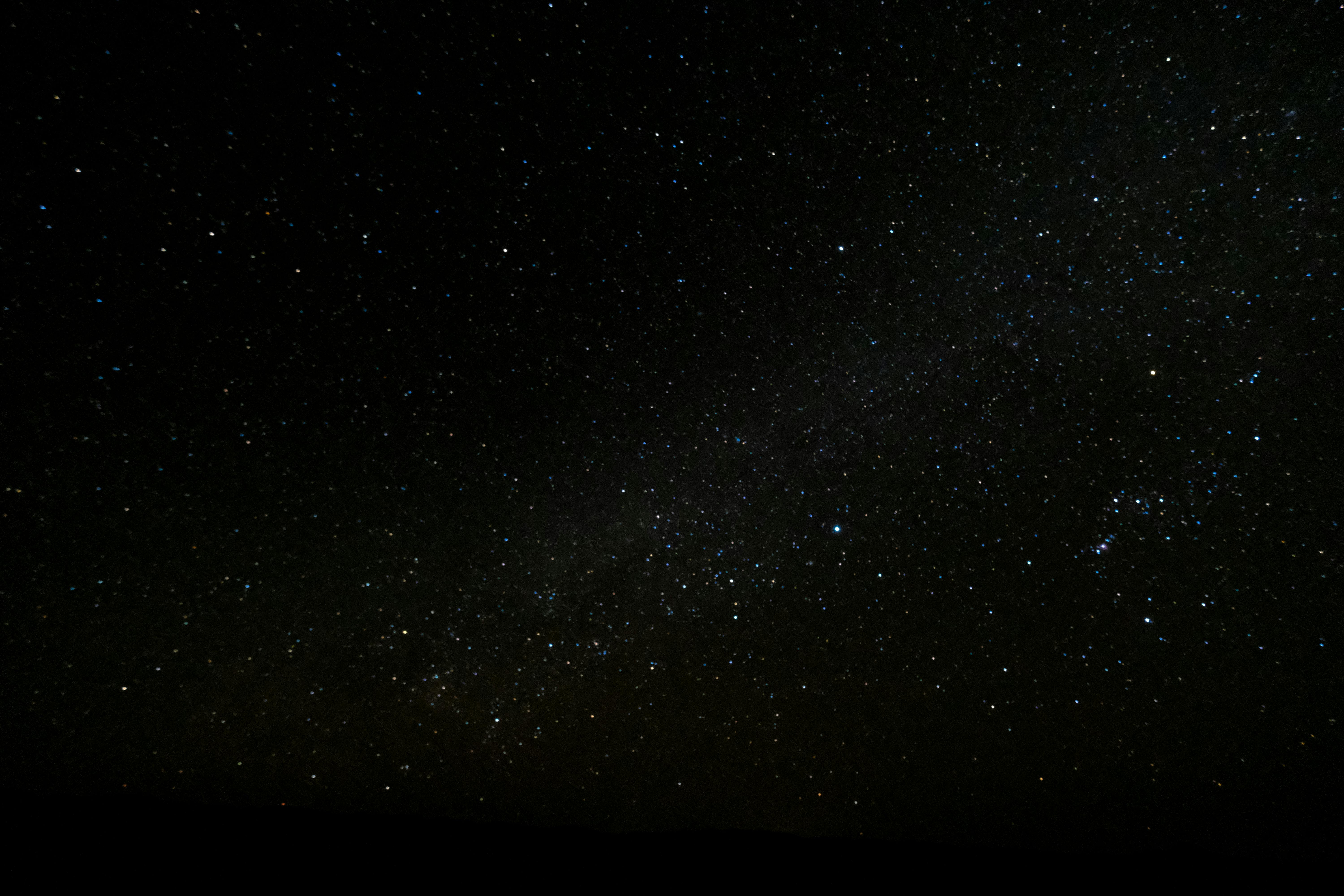
#workskin .summary.module .userstuff {
/* Opacity not needed, but it's a bit harsh without */
/* with a later fic's test bed, I opted to adjust opacity (and gamma) at a random [free] site from a Google search of the terms {adjust image opacity online} (and changed Pinterest's auto-canvas to #ffffff), though there are plenty of freebie sites where you can erase background or text (just run a search for something like {image erase background} or {remove text from image online} and you'll find places like remove.bg or Pixelcut [I used this latter to remove text from a The Thing poster before adjusting the gamma for a Snoopy crossover WIP, though you can see the results in my OTT CSS demo piece, ch. 1]) */
/* alternatively, instead of adjusting gamma elsewhere, one could apply a div in front of an image (e.g.:.some.targeted.area nth-child(...) or nth-of-type(...) conic-gradient: (hsl(0 0% 100% / .5) 0 0), though sizing is a bitch due to different devices' / browsers' viewport aspect ratios) and have the result paled-out thus (though this would work only with Creator's Style turned on, and hence would result in the non-gamma tweaked original image with &style=disable). */
opacity: 0.9;
/* See below re. width's f/x */
width: cover;
/* Used a free image site for the star field,though the result isn't the same as the original*/
/* Skin-parser rejected the Waybacked image's URL (which work-HTML-parser wouldn't have) */
/* pexels-photo-176851 is nice too, but a bit too light blue */
background-image: url('https://images.pexels.com/photos/998641/pexels-photo-998641.jpeg');
  /* EDIT 20 Feb 2025:  Fixed the image-size problem! */

  /* Forces total image to fit into the element, no crop */
/ * Also, sometimes the REM comments now remain if you have a space between the leading slash and its asterisk */

  / * they can break that rule, but you could then copy-and-paste a duplicate of it sans comments, */

  / * though that could be a bad idea (maybe unforeseen self-interaction); */

  / * other rules seem to continue to work fine even with the comment */

  / * I haven't tested for variables, such as which rules work/fail/prohibit, or if multiple rules can be commented */

  / * but 23 Feb I realized that the comment's presence had deleted the blue ink declaration in my blue-underscore-links rule; */
background-size: cover;

  /* EDIT 24 Feb 2025:  Noticed small repeat of image (hard to see), so edited both width and background-size from 100% to “cover” (minimal crop) and added back-ups: */

  height: cover;

  -webkit-background-size: cover;

  -ms-background-size: cover;

  -o-background-size: cover;

  -moz-background-size: cover;

  background-repeat: no-repeat;


  /* EDIT 24 Feb 2025:  Modified text  */

  /* Transform here (shorter height) gives visual impression of words leaning away */

  /* Perspective is still expunged by CSS parser, so can't constrain the userstuff text into isosceles trapezoid */

  /* Downside is that the image is also shorter height due to shorter containing element, but the height of the userstuff area isn't reduced */

  /* ...and you must explicitly undo this for the chapters */

  transform: rotateX(45deg);
/* bg color AFTER background-image is fallback in case image ever fails (as it does in TOR, apparently) */
/* bg color RGB fallback, however, should come BEFORE one's preferred target RGBA */
/* In the case of more and less advanced CSS techniques, you need the older simpler stuff above the later more advanced stuff */
/* If you have equal specificity weights, lower-down declarations tend to beat the upper, ditto for lower-down rules, but it's a lot more nuanced than this REM comment can address */
background-color: black;
/* test the bg color by replacing the bg img with a known-fail image's URL */
/* background: url('http://www.vanseodesign.com/blog/wp-content/plugins/photo-dropper/images/cc.png'); */
/* Late adjustment: font-family failed due to Trade Gothic Bold No 2, but works with Trade Gothic Bold */
font-family: Trade Gothic Bold, News Gothic Bold, News Gothic, Univers Light Ultra Condensed, Alternate Gothic, 'Pathway Gothic One', "News Cycle", sans-serif;
/* Eyedroppered an image of the orig. crawl text, though it might not be a dead match for what they used */
/* Any paint program has one, but there are online eyedroppers to which you can upload a pic or drop a URL, if needed */
color: rgb(255, 213, 2);
text-align: justify;
font-size: 1.5em;
padding: 1%;
}
#workskin #chapter-1 .summary.module .userstuff,
#workskin [#chapter-2 and all subsequent chapters same as above] {
opacity: inherit;
width: inherit;
background: none;
background-color: transparent;
background-size: inherit;
/*Problem: resetting the font color with black, none, initial, inherit (yeah, I know)... it's all black, which is a problem if reader's in Reversi*/
/* Problem solved: needed background: none;, not background-image */
color: inherit;
text-align: inherit;
padding: inherit;
font-family: inherit;
transform: none;
font-size: inherit;
}
#workskin .Note_to_self_number_1 {

  content: "Of course, it now occurs to me that if '/*...*/' is kill-switched, then you could simply leave yourself notes between rules, I guess... it's a total bullshit way of doing things, but, yeah, OK, whatever kludge gets you through the night, I guess, right?  Emdashes, double spaces, apostrophes, periods, slashes, these are all OK, just no semicolons allowed in the content for some reason (parentheses...: the sanitizer doesn't scrub them, but they break your entire work skin without any notification... or at least all rules that follow the parentheses... except that sometimes they don't break the following rules either — maybe just don't use them.  I have a few that haven't broken my skins, but I won't add more).  Even / * note-looking stuff * /, with a space between the asterisk and slash, just don't abut them or your actual note's internal content will go away.  If you view this QRL's page source, then you'll find a few notes about problems that I've encountered in writing notes and in writing rules, some of these problems not coming up in other peoples' rules.";

}


#workskin #chapter-[x]-addendum .chapter:before {

  content: "/ * Could do the REM note like this, incidentally, but it just seems a bit messier to me. * /";

}
and for the particularly curious, yes, you can apply a static image or a .gif straight to the whole work (including even the chapter and work preface groups in one fell swoop) thus:
#workskin {

  /* Opacity not needed, but it's a bit harsh without */

  opacity: 0.9;

  /* Skin-parser rejected the Waybacked image's URL (which work-HTML-parser wouldn't have) */

  background: url('https://images.pexels.com/photos/998641/pexels-photo-998641.jpeg');

}
but it kind of sucks as-is, because [as noted in the Green Rain proof of concept] although it does extend the image nicely a few extra pixels to each side beyond where the work contents themselves are, it also reduces the actual written text's opacity 😞 (if opacity changes are applied within the work skin; not so much of a problem if the original image doesn't need opacity to be adjusted under any reader's site skin conditions, I suppose — however, adjusting the image's opacity first and then using that result fixes this issue 🙂).
I tried some workarounds to the img problem, because of course:
#workskin {

  /* Using some generic tie-dye pattern from Pinterest */

  /* and before I forget: URIs [rather than URLs] get scrubbed */

  /* or convert to pure CSS, if you can get a small enough result to fit AO3's 500K char max */

  background: url('https://i.pinimg.com/1200x/60/54/4c/60544c8622d5cab8b20211be34450c8f.jpg');

  background-size: 100%;

}
That tie-dye comes out nicely in default, though I happened to test it in Reversi (Your_AO3_URL_Here?site_skin=929), which I normally don't do (there are far too many variables for me to test for everything, so I just check that they work OK in default and when my browser's narrowed like a 'phone)... and the whole preface group was a block of darkness with white text (so, I'd need to add CSS to make the group clear in order to see the pretty background shine through it), and the text everywhere went white (which was fine in the dark bg preface, but not so great on the tie-dye bg main article). That tie-dye image happens to blend into itself, repeating in a way that is obvious if you watch for it, but without any jarring jumps, so the vertical scroll looks pretty behind the text (at least under normal conditions).
NB 1: Adding declarations of -webkit-background-size: cover;, -ms-background-size: cover;, -o-background-size: cover;, and -moz-background-size: cover; will stretch and smear the tie-dye image's pastel into a less busy and eye-straining cloud-like background; taking it a step further with max-width: 100%; and max-height: 100%; will further stretch your image and your entire work area (including Summary, header- Notes, and footnotes) horizontally, permitting the text to sprawl fully across the screen (i.e.: the work's bg img and article text will take the same width as the data block, with the Summary and Notes sections being just a little narrower than that, though still wider than normal)... at least on a wide computer monitor (looks pretty much unchanged when I compare the original and affected on separate tabs with the browser shrunken to minimum width, so maybe no real effect on 'phones either).
NB 2: AO3 cautions that applying -webkit-...;, -ms-...;, -o-...;, and -moz-...; in one way will lose all but whichever one is last on your list, and another way will work fine, but neither is the way that I've been doing it (and there are more... I'm not about to try testing for all variables...).
NB 3: Going whole hog with z-index: 1;, position: absolute;, top: 0;, and left: 0; covers the entire data block (i.e.: hiding even all of the buttons [next, chapter, comments, hide creator's style {Your_AO3_URL_Here?style=disable}, etc. — though at this point you really should add such a link into your fic so that your readers aren't fucked if they don't know how to do this, and you can then still get kudos, comments, etc.], and thus leaving you only the topmost 2 rows of the site: the AO3-home button and your photo drop-down and stuff, and below that the red search bar row [well, that and a thin div of whitespace]) and even the bottom row of the site (for reporting and stuff), while also completely filling the width of the browser window (edge to edge: not limited to the data block's width).
Still-more interesting is assigning position: absolute; and top: -20%; (for my screen, -16.9% goes to the very tippity-top, covering even the login reminder and AO3 logo regions, but a screen with more than 1920 pixel lateral real estate would need >|16.9| [e.g.: 17, 18, 20, etc.], and adjusting the browser window's width narrower shows that smaller abs. val. percentages suffice... 'til we run into that pesky business of the image disappearing from too little real estate, of course — but we can cause the image to remain visible even when in too-narrow a screen by using cover instead of 100%). This is when the z-index comes to the fore: -1 or lower permits the header area to be visible, with 0 through 9 covering everything except the Hi_[username], Post, and Log Out buttons, and 10 or higher covering everything. The fic gets cropped in the process though, if using overflow: invisible; so... potential there for an “interesting” reading result (maybe fourth wall characters can read what isn't visible there, or it could be a simple hack-challenge to the reader?). Particularly interestingly, that same top limit is at about -6.4em or -109px to cover everything, but with a key difference: too narrow a screen doesn't cause the bg img to disappear with either of these two! (Curiously, the CSS parser doesn't accept +0, though -0 is perfectly OK [and unsigned 0, as you might expect here]....)
The Footer (Customize, About, Contact, Development) remains, though. I brought z-index up all the way to e209 before assuming that the footer might presumably be the parent element, in which case no matter how big the z-index, the Footer will remain on top. There's a way around it (without calling the work skin from the HTML), I'm sure, there always is... I just haven't found it yet.
05 May: I forgot to mention on 26 Feb that I had found most of a solution (you can fill in all the way to the site footer, but can fill the site footer itself only at the expense of making the clickables unclickable — now to work on that problem...). Cribbing a note from TrueMaybeFalse's ch. 3, with some modification:
/* First rule is needed for second rule to function */

#workskin {

  /* 1em needed, or else it gets a funky whitespace on the right */

  font-size: 1em;

  margin: 0em;

  padding: 0em;

  max-width: 100vw;

  overflow-x: visible;

  overflow-y: visible;

}


#workskin .footer_bg {

  /* position needed in order to cover [red] site footer */

  position: absolute;

  /* left -10em will cover that bit of white space to the left */

  left: -10em;

  /* 122vw width adds a little extra bg beyond the right edge of a broad monitor, but is a necessary balance for narrowed browser (must test vs. 'phones) */

  width: 123vw;

  /* 11em leaves a pixel or so of extra whitespace, so just use 12; 40em if you plan on the z-index trick below */

  height: 12em;

  /* The z-index covers entire site footer:  nothing clickable in site footer  */

  z-index: 1;

  /* This [if z-index is at least 1] obscures the site footer: visible only if RGBA opacity (last value) is less than 1 */

  /* if z-index isn't present or isn't 1 or more, then this only covers area above footer [and below, if on a monitor and balancing 40em, but shouldn't(?) create that extra grey below the footer if on a 'phone] */

  box-shadow: inset 123vw 50em rgba(0,0,0,.2);

  /* ALT: different specifics, same result */

  /* box-shadow: inset 0 0 0 100vmax rgba(0,0,0,0.2); */

}
and at the bottom of your fic, the last item needs to be this empty div (which will call the obscuring block into existence):
<div class="footer_bg"></div>
which could be combined with the header-blocking stuff to present a single page work with no site header or footer, but which would be a pain for most readers without that disable-creator's-style link tossed in (and might mean less reader interaction, kudos, etc., though it'd still be cool proof of concept). TrueMaybeFalse takes a different approach in ch. 2 (don't forget to right-click to view the page source), but with the same visual effect.
NB 23 Mar 2025: On Friday (two days ago), I got a bug up my ass and put together a sort of sampler pack of CSS party tricks in Inside, Outside, Upside-down, to demonstrate the effects of some of the wilder things that you can do (and I don't cover pseudo-classes in this QRL nor the Fonts tutorial, but... you might like the demo's caution... with CSS on a single paragraph within the work summary). The results are based upon those outlined here, above, and mentioned elsewhere in this QRL, but are obtained differently from the executions by others mentioned herein; whether that's a good or a bad idea, I don't know (sometimes specific methods are no big, other times they can be crippling to the intended effect, due to device differences). if you hit that, just be sure that your volume is low for the first page; there's embedded audio that works in Chrome (at least until some future build breaks that), and to an extent in other browsers (details in that work's ch. 1 notes), and though completely SFW , nonetheless I don't want anyone to blow out their eardrums or have a heart attack, y'know?
SPECIAL NOTE: When doing one like this, just as always, but in this case more than ever... check your results on multiple browsers with multiple aspect ratios, then check it across multiple devices (and on 'phones, turn them sideways for portrait vs. landscape), and then do all of this again in Low Vision Site Skin because it completely alters the height of things such as the screen top position and just how far down the bottom banner really is, and then maybe try it all again-again in Reversi if you have any special colors involved.
#workskin {

  /* Using that free starfield image */

  background: url('https://images.pexels.com/photos/998641/pexels-photo-998641.jpeg');

  background-size: 100%;

}
With the free starfield image from earlier (no change to the tie-dye rule, otherwise), the text is kind of grey and not so easy to read in default site skin, but looks fantastic in Reversi (Your_AO3_URL_Here?site_skin=929); the transition of one image to the next repeat of it is OK, though a little obvious at points.
NB: You could add declarations of background-repeat: no-repeat !important; and background-attachment: fixed !important; in order to lock the image in place behind the text (rather than repeating it automatically).
For shits and giggles, I tried the Matrix background (cf. entry in series of tutorials at bottom of this page) to see if I could improve on the container approach, and it was interesting; very dark as-is (though one can tweak gamma without going through all 150 frames individually [though again: alternatively, instead of adjusting gamma elsewhere, one could apply a div in front of an image {e.g.: .some.targeted.area nth-child_or_nth-of-type(...) conic-gradient: (hsl(0 0% 100% / .5) 0 0)} and have the result paled-out thus (though this would work only with Creator's Style turned on, and hence would result in the non-gamma tweaked original image with &style=disable]), and with long pauses between visible glyphs, but damn do they make an impression (NB: These come out large, I only gave it a soft run through, so didn't bother to see about changing anything like total width, font-color, etc..):
#workskin {

  top: -2em;

  left: 0;

  right: 0;

  overflow: visible;

  margin: none;

  background: url('https://upload.wikimedia.org/wikipedia/commons/c/cc/Digital_rain_animation_medium_letters_shine.gif');

  max-height: 100%;

  max-width: 100%;

  -webkit-background-size: cover;

  -ms-background-size: cover;

  -o-background-size: cover;

  -moz-background-size: cover;

  background-repeat: no-repeat;

}
It's when you start applying something like the complicated schtick from Green Rain that it gets... messy.
If you start with the .bggif and .borderinvis CSS from the Green Rain example (and the associated HTML right below them), where they had been needed for the context there, and use those as the template to spread your normal image across your fic as a background (which could be necessary if you have an image URL that the CSS parser refuses, but which does work in an HTML container), it's bad juju, no bueno. I'm not sure now what my CSS and HTML had been, but the stretched image background was quite pretty. The thing is that I spent a while trying to fix the problem of the z-index and opacity and when I reinserted the old CSS (with or without the HTML container) I got a very different (and insanely wild) result.
There's an old site that I loved for 20+ years (since c2002: Pathguy's [Li Po's] D&D site), and I just found out on 14 Feb that it was down, and apparently went down for good at some time after 14 Sep 2024. I wanted to do something in honor of the site, and one of the page backgrounds (chaosbak, for Arborea) was a great fit for one of my WIPs' MC's nature. Long story short, the page's owner's main page said that e-mails were cool, but asked no texting or chatting... and there was no e-mail contact address, so I couldn't ask permission to use his bg img (and I wasn't about to simply use it without). I was at loose ends, so tested things while trying to work out what to do, and found that although the CSS parser rejected the Wayback URL of his image, I could embed the image using the technique in Green Rain, which ended up stretching it out.
It still left the issue of the image disappearing with too-narrow a browser width, of course. I discovered that this was due to the z-index, but that with removing the z-index to permitting the image to stay when the screen was narrow, the opacity then caused the text to be faded and non-selectable.
I did a bunch of tinkering over the next week (a lot of stuff, and yes I tried text-opacity). Finally, I tried the simple solution of #workskin with just background and size, and that worked, but then AO3 did some maintenance on 21 Feb (maybe unrelated and purely coincidental), and when I reinserted the old CSS (the long one, with the opacity and z-index), the whole work faded out and began at the top left of the page just beneath the fandoms / browse / etc. buttons, overlapping 2/3 the data block, but the data block was followed immediately by the bottom of the page stuff (Customize, Contact, etc.), and the actual page of [still faded-out] content continued on downward from there (and fully scrollable, cursor-selectable, etc.)... so I guess that by applying position: absolute; — the absence of top: 0; will still work similarly, just moving the work down a little from where it would be with both declarations (same result as left: 0;, and same principle, just on the RHS, with right: 0;), and bottom: 0; is hilarious — one can cause the work to exceed the bounds of the normal work area (see CSS below, followed by illustration of the now-described effects):
#workskin {

  position: absolute;

  top: 0;

  opacity: 35%;

  width: 99.7%;

  overflow: visible;

  height: 100%;

  background: url('https://i.pinimg.com/1200x/60/54/4c/60544c8622d5cab8b20211be34450c8f.jpg') repeat-x bottom;

  /* cover (instead of 100%) fixes the problem of the bg img disappearing with too-narrow a screen */

  background-size: cover;

  z-index: -1 !important;

  -webkit-background-size: cover;

  -ms-background-size: cover;

  -o-background-size: cover;

  -moz-background-size: cover;

  background-repeat: repeat-y;

  background-attachment: scroll;

}

(zoom)
Work skin CSS causing work to overlap into site areas
* Firefox users: sorry for the previous format; I hadn't realized 'til 08 May 2025 that figcaption, which works on AO3 in Chrome, was borked in FF.
You could obtain somewhat similar results with transform: translateY(-50em);, though you'd need to muck around with things; as-is, this will move the background (hiding things) and fic (on top of the opaque background) into the site's data block area, but on a wide browser you lose some of the title area and on a narrow browser some of the data block still shows up at the top.
<div class="notice">
NB, 21 Apr 2025: for those of you wondering about a couple of the colorful cautions and notices and such sprinkled into this QRL (and used heavily in ch. 6 of Inside, Outside, Upside-down ), I would cover them here (as good a place as any, I guess), but a few days ago I found that CodenameCarrot had already done an absolutely phenomenal job of covering them (and a lot of them, at that, many of which I had no clue of) in detail in their Chapter 9 update four weeks earlier of A Complete Guide to 'Limited HTML' on AO3. Sometimes you can get the same result from different specifics, as with their use of <div class="error">, which is definitely simpler and consumes just under half as many class-name characters as my use of <div class="alert flash"> (though some [public] site skins affect error without affecting the alert flash), and there are a few more that I mention in a comment thread there, but here's the quick-ref boil-down of the extras [that I know of] not in that chapter (and there are some good reasons for them not to have included these couple, but definitely do go hit their chapter for some really juicy shit!):
<blockquote>
<p>
<a name="footer" rel="nofollow" id="footer">the hard-to-read footer class can be used in comments (and when under the effect of some few site skins, actually becomes quite legible in one's work).
I had thought that I'd tumbled to this one myself, but the more that I think about it, the more certain I am that I know it from having seen it in Mewsmodeus (Mewzebub)'s comment thread with GumbaBunny.</a>
</p>
</blockquote>
produces a deep-red/maroon div div (which I suspect I first ran into in one of Mewzebub's comment threads) and is necessarily attached to an anchor (it's an #ID, after all), but it's a finicky little bugger (go ahead: use it in a test-fic, placed exactly where you want it in a paragraph, and see what happens, and then try to adjust it with a rule to the effect of #workskin #footer { width: fit-content; } and watch what happens; you'll see what I mean).
<li class="userstuff">
<a name="modal" rel="nofollow" id="modal">I ran into this one either in Mohnblumenkind's P̶e̶r̶s̶o̶n̶a̶l̶ Experiment with HTML and CSS or InfinitysWraith's several CSS works, I think — and quite possibly in each.
(Wait, belated update: actually it might've been over in 0_0_MLM's test work please ignore.)</a>
</li>
produces a lovely little thick-light-grey-bordered div (but also with a lot of extra space, not just to the side [when using it on just a word or two] but also a row or two of blank space below the text within it; you might want to adjust it with something like width: fit-content; margin-top: [some spacing, e.g.: 1em]; margin-bottom: [some spacing, e.g.: 1em]; padding: [some spacing, e.g.: 1em 1em 1em 1em];)
and
<div class="event announcement group">
<blockquote class="userstuff">
<p>
I worked this one out myself, from the recent donation drive (div instead of blockquote is fine, too)
</p>
</blockquote>
</div>
which produces your standard element-wide ruby red banner with white text, as you might guess.
<p align="center" class="child">Oops, I—</p>
Oh, and you might also be interested in the little baby above, the class="child" (cf. .own, .draft, .draft .wrapper, .unread, .child, .unwrangled, .unreviewed — they're not all identical though, as for example with .draft, which gets a dashed border), which I made use of in chapter 2 of Inside, Outside, Upside-down, and which produces the effect that you see in this paragraph right now (though what I used it for in that chapter is another matter entirely... [discotheque, anyone?]).
17 May 2025: I hadn't yet popped into AO3 this afternoon, and so was made aware of this next little gem by GumbaBunny in the Discord:
the <div class="announcement group"><blockquote class="userstuff">announcement group</blockquote></div>, (note the lack of the
eventclass in this one).
which is the same cornflower blue as a <div class="notice">, but without the border, instead having sharply delineated orthogonal div corners (ditto for class="qtip-content", which seems safe against the errant ways of users' site skins [cf. draft-in-caution, 3 paragraphs down, for another that seems to be safe], and to which I finally clicked for me 01 Jun, while poking through Mewsmodeus's work once again).
Naturally, you can cut things down to more-manageable sizes with something like the following (which I used for modal in that same work, but left unmodified here in order to demonstrate it natural effects), or simply the very first row alone (width: fit-content;, which I used for draft in that same work again), though I haven't spot-tested all of them for this ability (and I already cautioned you that footer is a pain in the ass to work with):
{

  width: fit-content;

  margin-top: 1em;

  margin-bottom: 1em;

  padding: 1em 1em 1em 1em;

}
<div class="caution">
<div class="draft">
NB, 28 Apr 2025: You might also have noticed that in this QRL's header-notes, I opted for a draft div within a caution div. I had wanted to use only the notice (which this subsection's whole parent div NB, 21 Apr 2025 happens to be), but found that it (and most others, actually) behaves poorly in some site skins (or at least disappears unnoticed [ha-ha] when using Reversi), and though caution remains bright yellow (at least in most site skins) the text drops to a poorly distinguishable dull-grey, but alert flash is a little too much when not warranted (e.g.: when you simply wish to draw mild attention to a specific note of minor importance...); draft at least keeps its dashed outline visible with a deep black background in Reversi, and in this combination it seems OK as grey-on-black in Default or yellow-on-black in Reversi but either way surrounded by a yellow edging (caution within draft, however, just gives a nice yellow background within the deep black edging... and has dull-grey font) — cf. class="qtip-content", 3 paragraphs up for another that seems to be safe vs. users' site skins.
I also used there a slightly different approach with the
<sup class="actions">
<sub>
<a href="https://archiveofourown.info/works/62524168?site_skin=1&style=creator" class="highlight-bright-yellow" rel="nofollow">Show Creator's Style with default Site Skin</a>
</sub>
</sup>
button (the sup and sub forcing the button stay in place within the text, much like a span, where display declarations failed, and the anchor's highlight coming into play only when hovered over in Reversi [or probably similar], where a highlighted span would only give it a thin border along an edge or two) from what I do in the footnotes'
<center class="actions">
<p>
<a href="https://archiveofourown.info/works/62524168/chapters/160022308#chapter_1_endnotes" rel="nofollow" class="highlight-bright-yellow">ch. 1's <i>footnotes</i></a>
</p>
</center>
button. Each is useful in a given context, but very different in the results. Play around with these and try your luck with other combinations.
</div>
NB, 14 May 2025: As a side-note, in the process of all of this, I've also discovered two minor things that I have no real use for, but maybe they'd be of value to you (I later realized that I had already seen [on the 7th, just the day before] the wildcard used following a child combinator >, in Mewzmodeus's TV emulation [complete with channel buttons and different contents per channel]):
-
On 08 May, I was digging through the rules for action buttons (in order to cause one as a span in the summary of a chapter) when I noticed something funny in the DEV tools panel (and of course it showed up on the page source 1_sitescreen.css [row 1484], where you'd expect it to). Anyone notice before that there's a wildcard function (in this case:
.actions *, but the fact of the “*” existing at all in AO3's parent site skin is what grabbed me, not the fact that it's attached to.actions *per se, though particularly interesting is that it's the only wildcard in that whole parent skin [I could check all of the others... but I'm not gonna])?
Naturally, I had to test to see if we can use wildcards in work skins, and... yup, they're just fine and dandy. I was lazy and simply used a JSFiddle from an S.O. thread (spec. from this answer):.actions * {
display: inline;
}#workskin div[class*='tocolor-'] {
color: red;
}
<div class="tocolor"> tocolor 1 </div>
<div class="mplampla"> tocolor 2 </div>
<div class="tocolor-2"> tocolor 3 </div>
<div class="tocolor tocolor-1"> tocolor 4 </div> -
I was reading a manga on ComicK.io this morning and noticed that someone had highlighted their comment (Time-stop-brave, chapter-3-en#comment-6091581, if you're really that curious) with
<mark>and</mark>(understandably), which naturally got me curious, so I tested it on AO3 (somehow, that simply never occurred to me to try).
You can use it, but the results aren't what you'd expect: in both single- and multi-chapters' summaries, header-notes, footnotes, and comments it does nothing to whole paragraphs, but will cause single words (or non-paragraph strings of words) to become their own paragraph; it has zero effect within the actual main-fic-body .article (where the<mark>and</mark>simply get deleted instead).
</div>
Here, see for yourself, already within this nice pretty cornflower-blue <div class="notice"> (which will fade into the background grey of the rest of this QRL in a moment, when you hit Reversi...), where everything should look perfectly fine while still in Default:
|
|
|---|---|
This is caution-in-draft with no span or anchor highlighting Click for Reversi. |
...and draft-in-caution, still neither span nor anchor highlighting: Click for Default. |
Here are some dull-grey (if in Reversi) caution-in-draft words, plus highlighting on the wrapping span: <span> Highlighted span, click for Reversi </span>. |
Here are some more words to show that you can read them better (in Reversi) with draft-in-caution instead, plus highlighting on the anchor: Hover over this button before clicking back to Default. |
Now we to show it ass-backward (still caution-in-draft though) where you can again see a solid hover yellow from the anchor (not the span): Hover over this button while in Reversi. |
...and why I don't highlight a span around the button (even with draft-in-caution): <span> Highlighted span, to show minimal effect while in Reversi </span>. |
For comprehensive comparison and contrast, this is the result of caution-in-draft though with highlight on both a wrapping span and the anchor itself: <span> Hover, then click for Reversi and hover again </span>. |
...and that same both-highlighted-span-and-highlighted-anchor against the draft-in-caution combo. (and I suppose that this last set is arguably the best bet): <span> Hover, then click for Default and hover again </span>. |
| * For those of you reading on a browser sufficiently narrow to kick-in the horizontal scroll below, who wish to know how to do that, cf. this portion of my ConLang walkthrough (don't ask: that's simply where I first really needed one [there was an earlier one that I kinda skirted around, from laziness], so... that's when I wrote and first-installed the CSS for it and where I wrote the How To note on that). | |
</div>
IMAGE FILTERS
After manually changing this QRL's text selection background color from a stark navy blue rgb(206, 155, 50) to a calm gingersnap rgb(49, 100, 205) by simply taking 255-n for the inversion values (go ahead: cursor-select some text and see how it looks), I got to thinking about color inversion for images. I'd rather adjust an image directly if needed, but I was curious, and maybe you need it for something.
There are a few filters to choose from, but here's the gist: you can play with filter: or -webkit-filter: (AO3 takes both: I tested) and adjust the values for each of the properties in the functional column, but the INOP column properties seem to be... inoperative (regardless of presence/absence of -webkit-). Naturally, the color rotation values are only 0°-<360° (rotate a circle one full turn, and what do you get? You can enter as large a number as you wish, positive or negative, but you still have only 360° of actual travel, like hands on a clock.); I used multiples of 60° simply for convenience in this demo. Grayscale and sepia are limited to 100% max..
Technically, there's also opacity(X%), but you're probably familiar with that one (and can guess that reducing it makes the image fade away and become increasingly see-through).
You can call their selectors in combination (more than one class per some image element) from your HTML, as with any other class, and ditto for targeting an image from your work skin.
The rule format for them, taking this one as an example, but with any of the toggles' names being suitable (I named them for their filter property names, to make it easy) is:
#workskin .rotate180 {

  filter: hue-rotate(180deg);

}
Check MDN and W3 (and their demo) for more detail, and maybe Google {CSS filter} for places with an SVG Gradient Map Filter to do custom things and spit out code that I have no idea what to do with (even with the example given at CSS Tricks; pay particularly close attention to their notes, which cover things like order mattering). Let's use a Warhol pop-culture Campbell's soup set for plenty of color comparison (again: I used multiples of 60° simply for convenience in this demo; one can use any other degree of rotation, of course):
| Default example: | Functional: | Seemingly INOP on AO3: |

|
hue-rotate(60deg)
hue-rotate(120deg)
hue-rotate(180deg)
hue-rotate(240deg)
hue-rotate(300deg)
grayscale(100%)
|
blur(200px)
brightness(5%)
contrast(2000%)
invert(100%)
saturate(2000%)
drop-shadow(80px 80px 100px grey)
|
| There are some... “complications ” with opacity — it's both functional and not-so-functional, depending upon what it's used in, hence no special column headers here, just side-by-side examples. | ||
|
img src, calling
|
opacity(50%) img injected from work skin
|
opacity(50%) via filter
|
Overlaying multiple images gets a little more complicated. You can plunk them into a table, but it gets really fiddly, and on narrow screens, images in side-by-side <td>s tend to get cropped a bit. Then there's the question of line-breaks being needed in order to get the images' full height to show up (and my immense thanks go out to TillyWunderWing for her help with it; her image overlay in chapter 5 of txtFileNotFound.pdf really grabbed my attention and is what drew me to playing with these back in May 2023) — I took the examples' images below from two of my own works, background from Megamechs 101: the Mona Lisa metaphor (illustrated) and midground from GEN 0 particles, or “too OCD”:
Para. w/ 2 img classes to split opacity fails
(z-indices and opacity irrelevant: only 2nd img-rule will show, regardless of which that is);
sadly, AO3 doesn't support isolation: isolate for text legibility,
hence trying #workskin .iso_zindex { color: red; opacity: 1; z-index: 3;} to class this element
(though it fails to isolate text from midground img's z-index: 2; opacity 0.5)


This example is a mod based upon the Δυναμικός! | Dynamic section of my Matrix / Green Rain tutorial / demo. Yes, I used hardcoded HTML linebreaks here instead of aligning things vertically via CSS: it's less janky, plus anyone might turn off creator's style with the button/etc. but they're less likely to us a site skin that removes linebreaks. It really is better suited to a background chapter that doesn't suffer from being spread out than to trying to drop background images into a paragraph.
It has issues, of course (the size varies with the width of the viewport, and suddenly ceases existing when the viewport is too narrow — and the viewport is fairly broad when it does that: looks like ~725px; you could try width with em [22.3 and 22.6, in this case] instead of %, and the text will scroll to match screen size, though it won't really stay centered with varying viewport width, but the image will remain a constant size [except right before it disappears, when it begins to squish horizontally, a little]), but in case it's of use to you, the work skin for it is
#workskin .bgimgadj {

  position: absolute;

  opacity: 100%;

  / * Use width, NOT HEIGHT (which would go nuts when you add or subtract paragraphs above and/or below it) * /

  width: 50%;

  z-index: -2 !important;

  left: 26.5%;

}


#workskin .midimg2adj {

  position: absolute;

  opacity: 80%;

  / * Use width, NOT HEIGHT (which would go nuts when you add or subtract paragraphs above and/or below it) * /

  width: 18.3%;

  z-index: -1 !important;

  left: 40.9%;

}
and the HTML for it is a breeze:
<img class="bgimgadj" src="Your_First_IMG_URL_Here" />
<img class="midimg2adj" src="Your_Second_IMG_URL_Here" />
and then line breaks and written text.
z-index isn't much more than arranging how high up (or low down) in a pile of things (each pile being what's called the context ) you want to stick something, or how high / low you want to stick some particular pile of things among a bunch of other piles (like objects on a dining room table, and such dining tables on different floors of a house, to borrow from the linked example there), though sometimes what's actually where can get lost in the mess of other components on your page if you have a lot going on all at once. MDN has a short, intuitive rundown on it and a more technical follow-up, W3 has a simple interactive that you can manipulate, and there's a nicely visually intuitive blog write-up at Netgen. Below is a representative image of stacking order, from the first link (EnvatoTuts+'s site):

(zoom)
|
Incidentally, do you ever need to know the exact centerline or to put a vertical line down the center of some span, paragraph, div (really, probably just about any element, in fact), or entire chapter? I'm always curious, but never actually needed it 'til giving those img examples above and mucking with some alternatives (due to the extra whitespace to the left of one image, and a narrower one to the right of the other). Here's your centerline (just remove the class name to apply to your entire work, or add |
Amusingly, though not terribly functional, one can target a pair of .classed italics [necessarily bracing an , though also preceded by one] with images:
The other problem with injecting images from the work skin is that, of course, they won't appear when one turns Creator's Style off, and turning Creator's Style on is easy, but a nuisance for those who have it off in the first place.
NB: In order to accommodate people's potential Dark Mode / Reversi preferences as well as Default readers, I've arranged for the buttons in either case, so that nobody gets blinded by sudden contrast change:
Bright screen default: Creator's Style OFF, and turning Creator's Style ON
Dark Mode / Reversi: Creator's Style OFF, and Creator's Style ON.
If this div is visible, then please ignore it and let me know that it showed up here as visible. It's here only in order to facilitate some comment magic. 😉
Hi, my name is... Slim Shady!
This space 4 rent — Aahz. 🧙
What would you do〰 for a Klondike bar?
In the process of working on the Star Wars crawl though, I ran into some interesting things. Entering a rule set for a .summary.module and a second entirely different one is allowed (i.e.: in the sense of BOTH #workskin .summary.module {some rule(s) here; } AND ADDITIONALLY #workskin .summary.module {some other rule(s) here; }), though it dropped the Summary down into the main body text, which caused some of the summary text and some of the covered text to each be selectable by the cursor, but not all of either.
As well, in messing with trapezoids, height: inherit;, width: inherit;, height: auto;, width: auto;, and height: 100%; were all useless, but width: 100%; budged the Summary userstuff's right margin outward [beyond the div's site-determined width of the Summary-header underscore] by 22px (so I left that as-is, as shown in the crawl pic.s).
I also found that I could cause an acute triangle (from top left to right a few inches, down a centimeter, and back) to appear in the Notes header when trying to apply the below (which is not part of the above listed work skin) to the Summary:
#workskin .summary.module .userstuff:after {

  content: "";

  position: absolute;

  bottom: -20px;

  border-top: 0px solid gray;

  border-right: 200px solid gray;

  border-bottom: 20px solid transparent;

  border-left: 0px solid transparent;

}
However, seeing a bunch of images (or any at all) in a fanfic isn't everyone's cup of tea (and to those for whom this holds true, I apologize for this QRL's heavy reliance upon them), so in case that's you, you can create a site skin (or modify the one that you're using) with the following rule to eliminate pic.s:
img {

  display: none !important;

  visibility: hidden !important;

  width: 0%;

  height: 0%;

}
or if you're a browser extension person, then there's a Greasy Fork script called AO3 Hide Images to do the same (NB: I don't use it, I only ran into mention of it, so I can't say how well or poorly it works on any given browser / device).
And as a side-note, for those wondering about T̨̼͒ͩ͞͞h̢̘͕͆͊̐e AO̘̙3͚̀͐̀̄̃ͯ ̴ͣ̀́Curs̨̧̟̎ê̮̠̬͚̹̩: yes, it's alive and well. On or not long before 20 Nov 2024, I got a pop-up alert:
Warning: reliability is degraded
Back up your data in case of drive failure
Estimated remaining life: limited
Available spare: 24%
Temperature: 46° C
which was just a little unnerving. I found some freeware to tell me more (CrystalDiskInfo), but the bottom line is that it's now down to 15% as of late last night or early this morning, so I gotta replace my computer soon (5.25 years, eh? So much for SSDs' vaunted stability and lifespan...), and the new one will doubtless come with a handy, dandy, and oh-so-helpful Big Brother “A.I.” (the LLMs are not actual A.I., being as much so as an automatic door or a pocket calculator, but my pointing this out in a world that calls even TTS screen readers “A.I.” is like fighting the tides with a toothpick...). At the current mean average rate, it might last 'til ~30 Mar (though it had looked like ~mid-May for a while, so maybe it's accelerating, or just a bit variable [ONE WEEK LATER: it's definitely accelerating, having gotten to 11% now, at which current derivative I might get 19.5-22 days more out of it; time to replace the drive...]).
As a kicker to this, my wireless keyboard's batteries died just as I wrote “20 No” (remind me to make sure that my next computer is WIRED on keyboard and mouse!).
Oh yeah, and my car started making weird whirring noises last week, and my mom's waiting on heart surgery.
It never rains... but it pours ! 🤣
That's it, that's all, nothing else,
so until next time:
Be [most] excellent to each other, and PARTY ON, DUDES!
❤️
Also in this series:
- Part 1 — How to AO3
- Part 2 — Fonts, and colors, and work skins, oh my!
-
Part 4 — Inside, Outside, Upside-down
(a showpiece of fun that one can have with CSS; caution re. volume;
with CSS on a single paragraph within the work summary, among other things) - Part 5 — How to make and fix a series on AO3
-
Part 6 — Analyzing AO3 reader traffic flow
(one's own fics' reader traffic) -
Part 7 — A year-long AO3 overall traffic analysis
(reader and new-upload traffic in general, across all of AO3) -
Part 8 — Green Rain font, from The Matrix
(for simulating the digital rain effect) -
Part 9 — Building ConLangs, with a concrete example
(constructing languages)
O ~~~ O